Data Visualization Project
28 Nov 2019Part I
Outline and high-level summary
In my data visualization final project, I will appeal to people to adopt instead of buying through the visualization of status quo of animal adoption. According to the story structure in the Good Charts book, I will divide my story into three parts: setup, conflict, and resolution.
Setup: Many cats and dogs were sent to shelters every year for difference reasons.
Conflict: People are more inclined to use other methods than adoption to get pets. Pets in shelters has different outcomes. Some of those pets were euthanized.
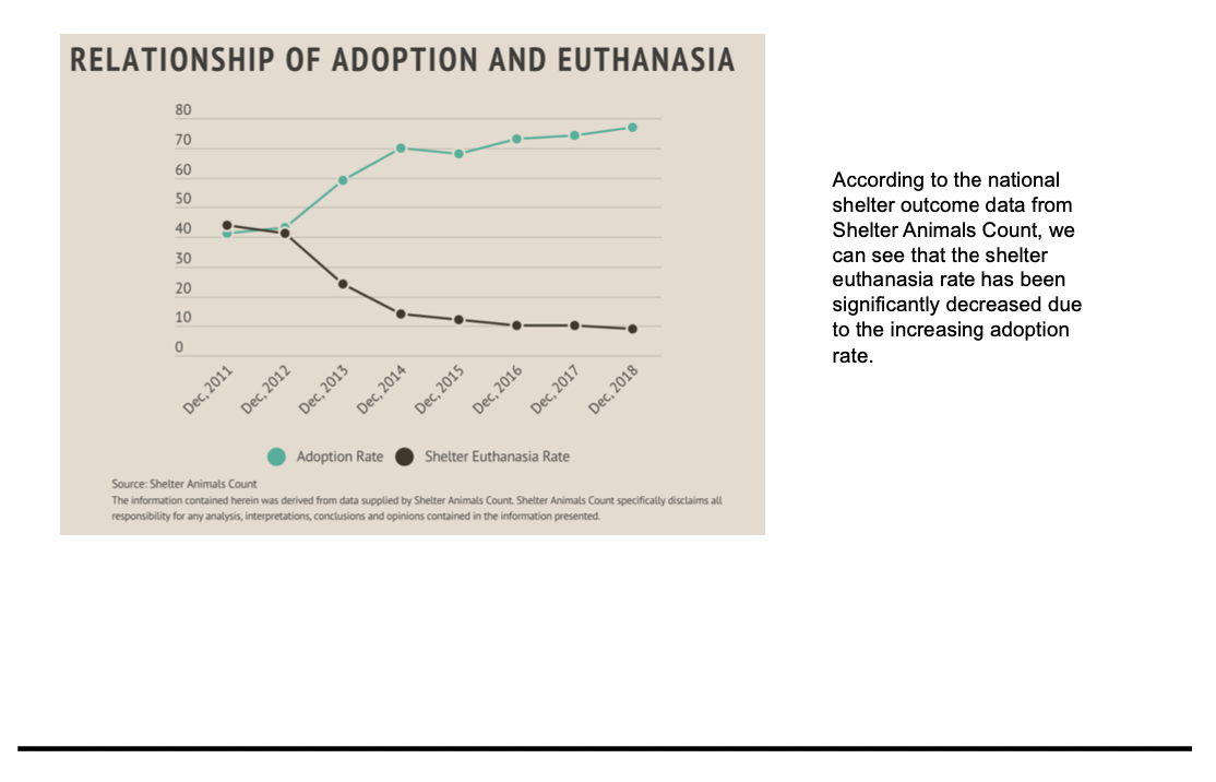
Resolution: Euthanized rate was declined in recent years due to the increase of adoption rate.
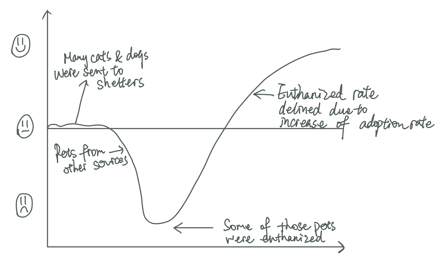
The data shows that many animals are admitted to shelters every year. When the audience sees it, the mood will be calm, because I am just telling the truth. However, in today’s society, many people still choose to buy breeding pets. Audience might feel a little sad since although many pets are sent to shelters every year, there are still people who choose to buy pets. Some pets are euthanized for various reasons. At this point, the audience will feel very sad, and some animals will lose their lives because of people’s lack of attention to adoption. Nevertheless, according to the historical data, we can find that the euthanized rate has declined a lot due to increase of adoption rate. At this point, the audience will feel delighted and know adoption is the best way to get a new pet. At the end of the story, I will give some suggestions about how to contribute to animal adoption. If you cannot adopt an animal due to several reasons, you can choose to donate. Or, at lease, respect and don’t hurt or discard any animals. The anticipated call to action is adoption instead of buying.
Sketches
Data
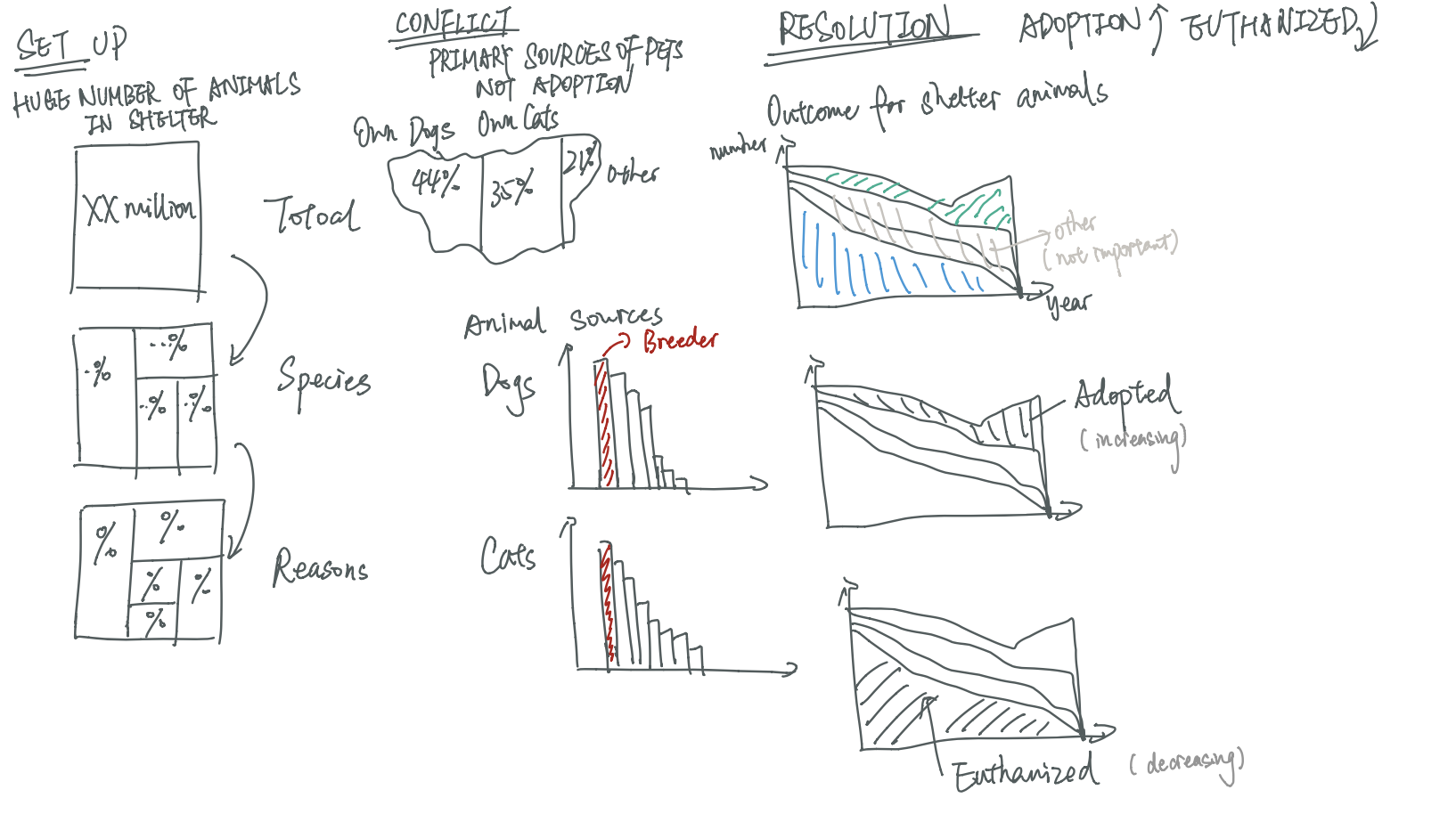
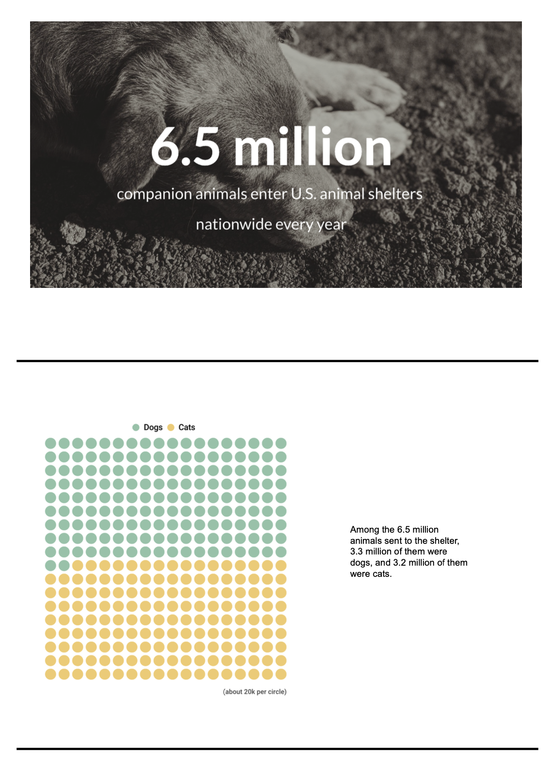
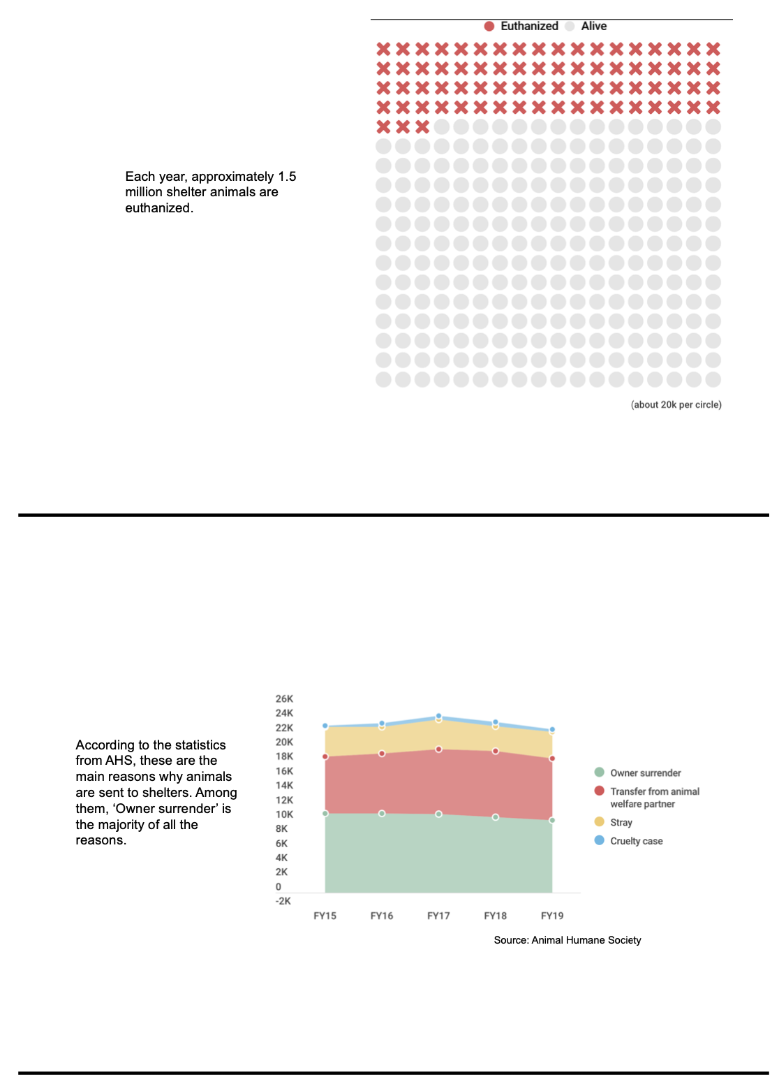
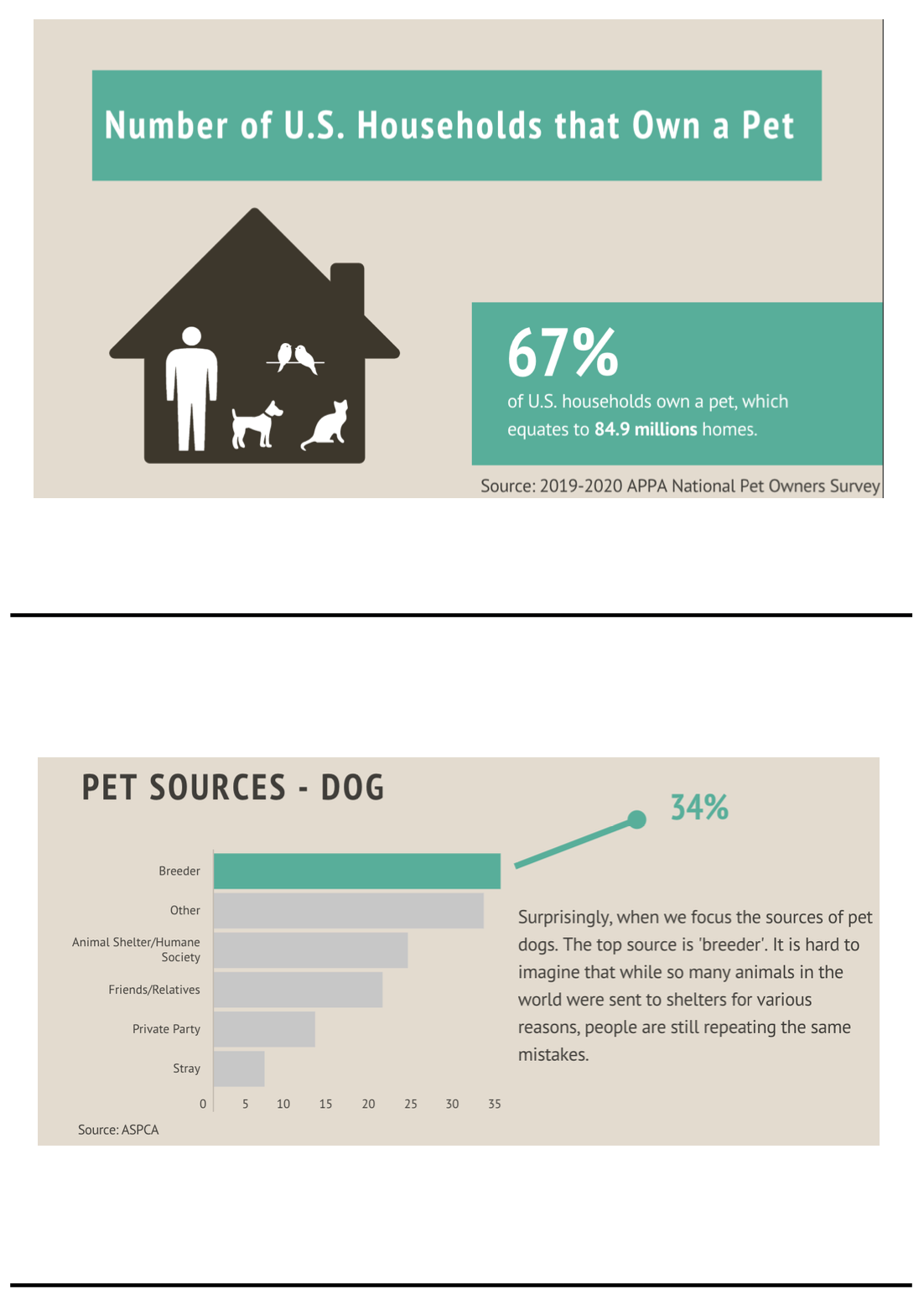
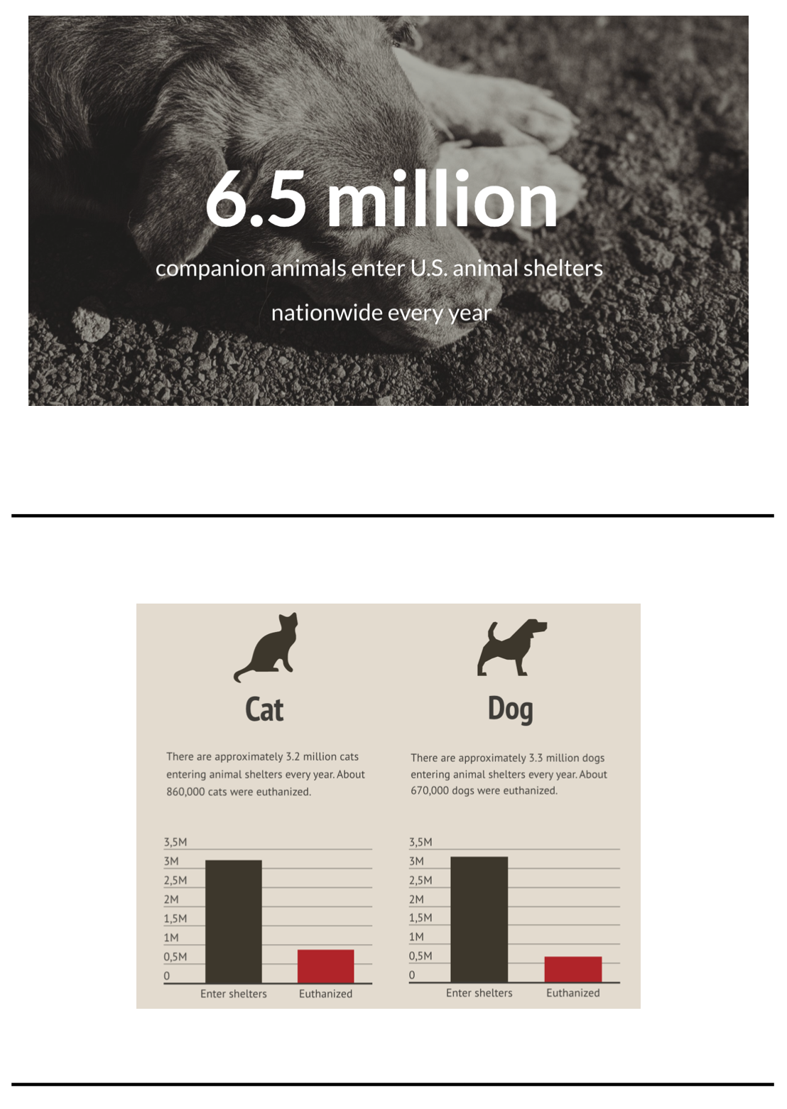
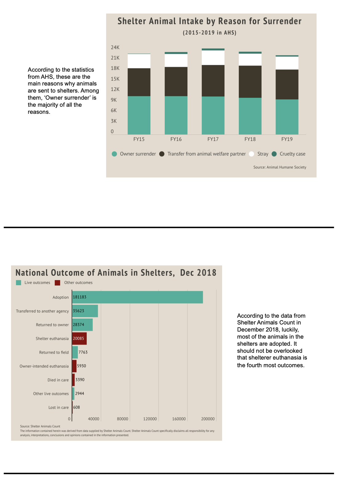
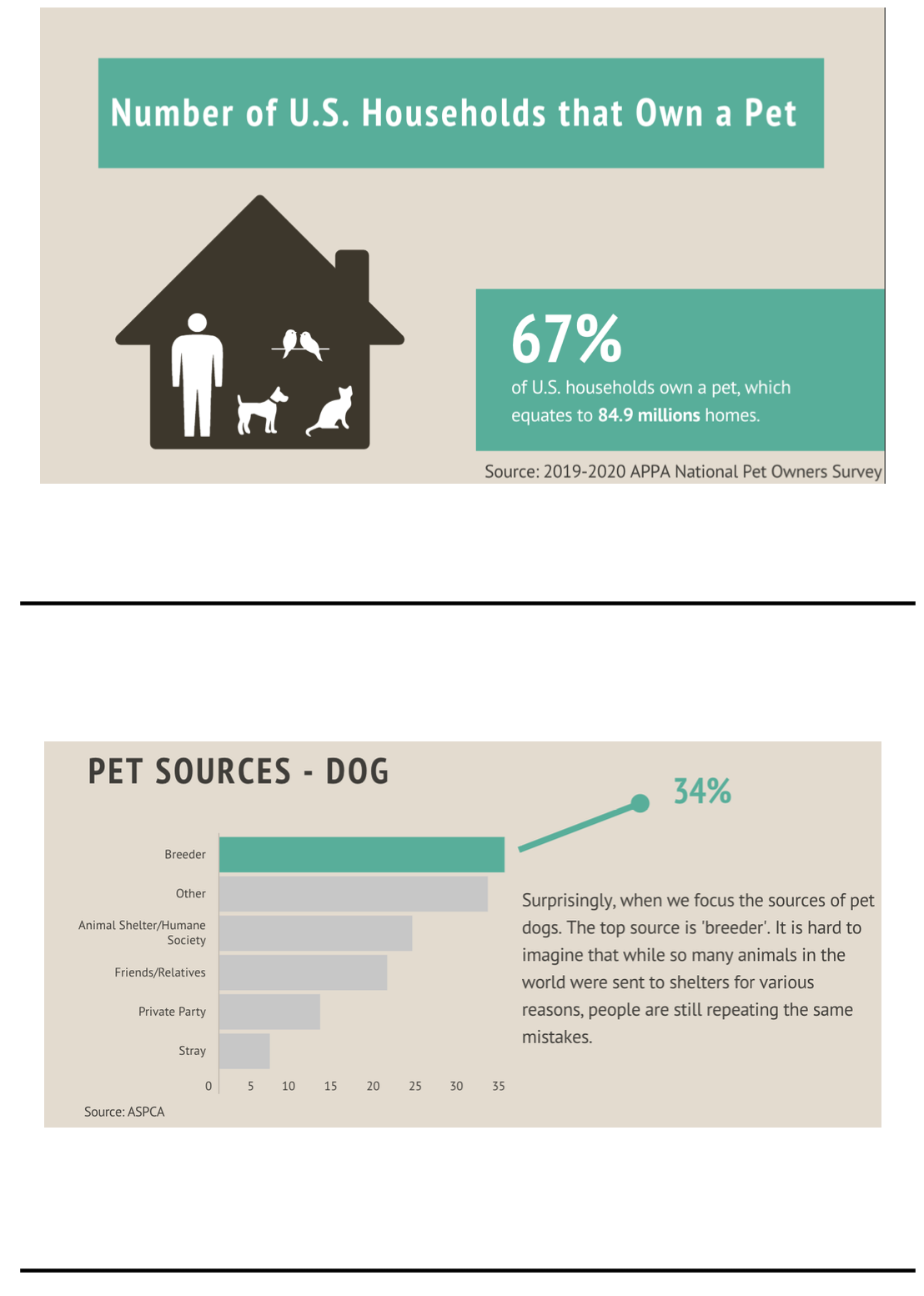
I found data from ASPCA’s official website showing the number of animals that were sent to the U.S. shelters nationwide every year. And also, the detailed number of cats and dogs were revealed. In addition, the number of euthanized animals were shown on the source as well. I prepared to use those data to describe the status quo of animal shelters in U.S. I planned to give an example of why animals would be sent to the shelter using the data provided by Animal Humane Society.
From the data provided by ASPCA, I could know the common source of pets in U.S. The data describing the pet source was in conflict with the previous data. I could say that although many pets were accepted into shelters every year, the first choice when people kept pets was not adoption. This difference made it harder for animals in shelters to have good outcomes.
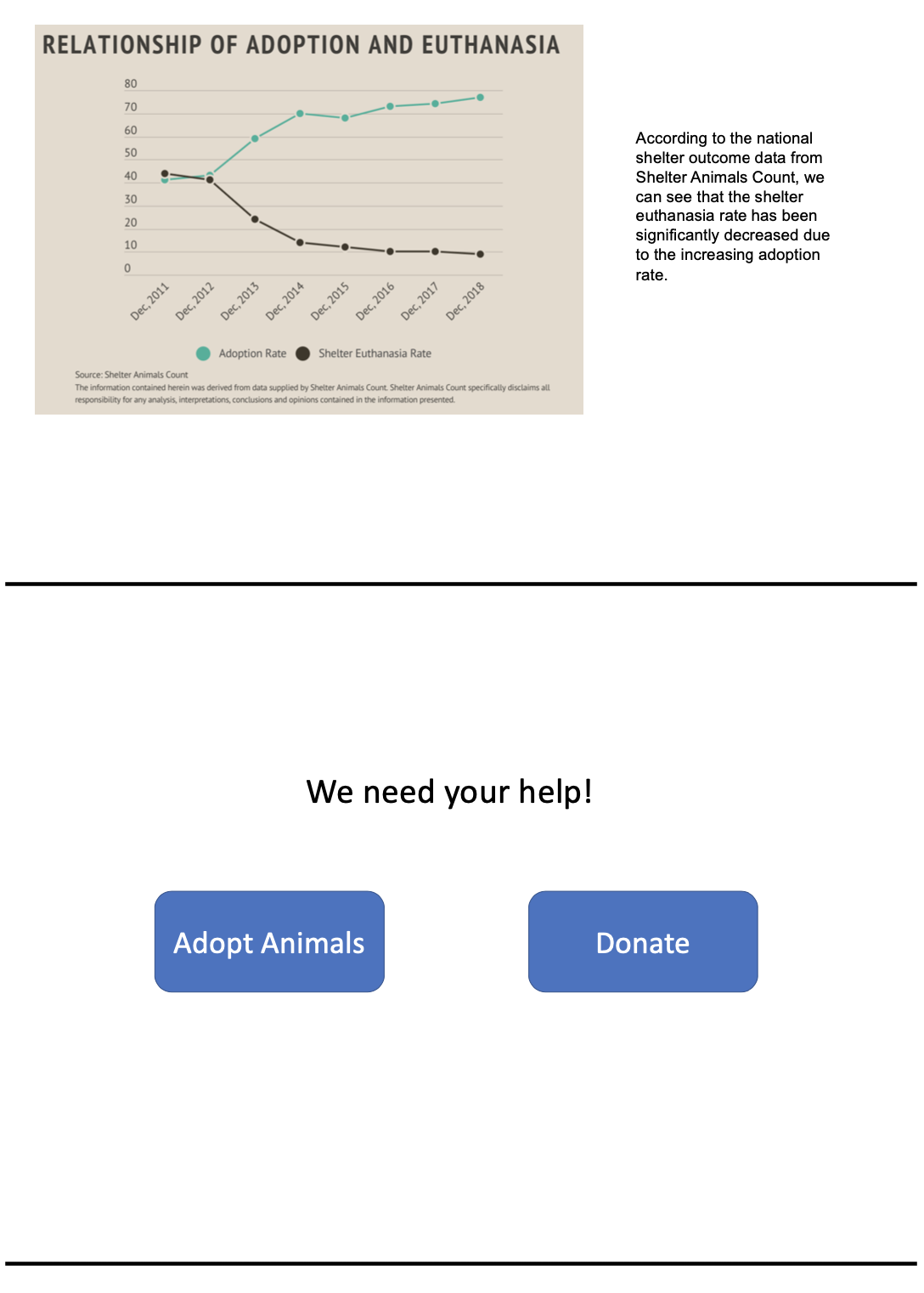
According to the data from Shelter Animals Count, the proportion of animals euthanized each year decreases as the proportion of adoption increases. I planned to use this data to show that adoption was a beneficial measure for animals in shelters, and to appeal to people to adopt animals.
Data source links:
[1]”Pet Statistics”, ASPCA. [Online]. Available: https://www.aspca.org/animal-homelessness/shelter-intake-and-surrender/pet-statistics. [Accessed: 15- Nov- 2019].
[2]”Shelter Animals Count | Explore the Data | Timeline”, Shelteranimalscount.org, 2019. [Online]. Available: https://shelteranimalscount.org/data/Explore-the-Data/explore-the-data-timeline. [Accessed: 15- Nov- 2019].
[3]”Lifesaving statistics”, Animal Humane Society, 2019. [Online]. Available: https://www.animalhumanesociety.org/about/lifesaving-statistics. [Accessed: 15- Nov- 2019].
Method and medium
I planned to do this project using Shorthand.
I will put a photo of the cute and poor dog on the homepage to get the attention of the audience using the “Text Over Media” section. Then I will start my story with the status quo of the American animal shelter using “Scrollmation” section and show some pictures of shelter animals using “Reveal” section. In the “Scrollmation”, I will add three visualizations showing the whole group and the groups divided by different intake sources and species. After letting the audience know that so many animals are sent to the shelter every year, I will show them the current source of pets of the American people in order to generate a contrast, so that the audience will begin to think. I will use the “Reveal” section to change the picture from shelter animals to domestic pets to show the contrast. Then I will use the “Scrollmation” again to show the data of pet sources, but this time, the visualization will be at the left side.
Finally, I will appeal to audience for adoption instead of buying by showing the increase of adoption rate can actually deduce the euthanized rate in animal shelters. Using the “Reveal” section, I will show the adoption and euthanized rate in full-screen and add highlight different part of the visualization to enable user to focus on each part. I will also express my understanding of those who are temporarily unable to adopt animals and explain that they can support animals in shelters in other ways, such as donations. I will add a “Media” section and embed some link to the animal shelters’ website to guide them take actions.
Part II
Storyboard, wireframes, and sketches
Research protocol
Target Audience
Because of the universality of my story, everyone can be the audience of my story. Those who just want to raise a dog will be reminded by my story to adopt a dog instead of buying a breeding dog. Those who don’t want to raise a dog may go to the shelter agency to help the stray animals after reading my story.
Goals / Questions
| Goals | Questions |
|---|---|
| Evaluate the engagement of the story. | Are those picture or icon there appropriate? |
| Evaluate the usefulness and completeness of the visualization. | Can people get enough useful and relevant information from the visualization? |
| Evaluate the perceptibility of the visualization. | Do people feel the visualization clear and easy to understand? |
| Evaluate the intuitiveness of the visualization. | Can people who saw this visualization for the first time know what the it is doing? (What confused the person, if any?) |
| Evaluate the aesthetics and engagement of the visualization. | Do people think the graph is beautiful and engaged? |
| Evaluate the logic of story. | Do people feel comfortable about the logic of the whole story? |
Background
Every year, many animals are sent to shelters for different reasons. However, people tend to buy breeding dogs when they raise dogs. I want to use this story to appeal to people to adopt instead of buying. This research plan is based on the final project of the course 94870-Telling story with data. This project is still in the beta version. I hope to use this research to understand people’s reflections to my story’s logic and data visualizations. The outcome of this research can help me improve the project so that I can better tell the story to the audience.
Participants
In order to test whether my story appeals to the audience is effective or not, I hope to find people in three groups to test my story logic.
- Those people like animals and want to raise an animal in the near future.
- Those people like animals and don’t have the plan to raise an animal in the near future.
- Those people who dislike animals.
Methods
- 10 mins interview
- Notes
- In-person
Script
Introductory comments
Brief introduction: “Hello, my name is Mengyue Wu, a graduate student in Carnegie Mellon University. I will ask you some questions and please feel free to express any of your opinions.” Quick discussion of the objective of today’s test: “The purpose of this test is to gather feedback from the audience to improve my project. Please note that there’s no correct or wrong answers. I am just looking for honest answers.”
Main section
To define the audience group, ask: “Do you like animals? If yes, do you plan to raise an animal in the near future?” “I have prepared slides here. This is just a storyboard of the website. I showed the main process and logic in the storyboard. Please imagine that you are browsing to such a webpage. Please take a look at this slides and mark down anywhere makes you confused.” (Wait for participant to complete viewing) Then I will ask some questions to deepen the research:
- “Would you please tell me what the project is about? Which parts in the webpage lead you to that idea?”
- “Can you get useful information from the data visualizations? Do you think the visualizations are relevant to the topic you determined before?”
- “Do you feel engaged in this project?”
- “Do you think the visualizations are easy and clear to understand?”
- “Do you think this webpage is beautiful?” If I get an answer like “umm…”, I will ask “Which part do you think is not good?”
- “What will you do after viewing this webpage?”
- “What else makes you confused, if any?”
- “Do you have any other questions about the webpage?”
Wrap-up
“Thank you so much for your time and patience! Do you have any questions for me?”
Findings
I completed three interviews with my friends. One of them likes animals but is not willing to raise any pets in the future. One of them likes animals and is planned to raise a pet in the near future. One of them holds a neutral feeling to animals. They fitted into the three groups I planned to interview with.
Positive:
- People could understand the topic easily.
- Most of the visualizations were clear.
- Provided useful information.
- Logic of the story was comfortable for them.
- All the people are willing to try adoption if they want to raise an animal.
- People who don’t want to raise an animal are willing to donate.
Negative:
- The dot plots were not beautiful.
- The visualization of stacked area caused confusion to two of the participants.
- People wanted more information about what the outcome of those animals in shelters was.
- People wanted to know how they could help and where they could adopt animals.
- The theme of the visualizations was not consistent.
Changes
- Change the dot plots to graphical data visualization.
- Change the style of the AHS visualization.
- Create another visualization to show the outcomes of the sheltered animals.
- Add the recommended approaches at the end of the story.
- Make the theme of visualizations consistent.
Revised storyboard
Part III
Intended audience
My intended audience is everyone. According to my topic, people can be divided into three groups: people who want to raise a pet in the near future, people who like animals but are not willing to raise any, and people who hold a neutral feeling to animals. I intend to let people either choose to adopt an animal or donate to those organizations that help animals.
Works
So far, in the process of doing this final project, I could feel that as my understanding of the target audience deepens, the project itself was improved a lot. At first, I just had a general idea of what I would do in the project. After outlining the story out, I got a clear logic of the story. Sketches made the story from text to visual graphs, which also made me step into the design process. According to the sketches drawn by hand, I created my very first digital storyboard to show to some people for feedback. I generated a user research protocol before I conducted user research interview. The research plan helped me a lot during the interview. I got really useful feedback from the interviewees. Initially, I planned to do some fancy graphs so I used different colors and themes. I actually got negative feedback in terms of the theme consistency. Thus, I decided to change the theme color and the visualization type according to the feedback. In addtion, deciding what kind of data visualization should be included in the story bothered me a lot. There were a lot of data sources, it was hard for me to pick those related to my story. Again, the feedback from the interview helped me to include those information that audience want to know, and discard the redundant information. I learnt that the audience’s feedback is very important, they could often see things I can’t find out and give suggestions accordingly.
Final project link
Click here to view my final project.
Reference
Data source
[1]”Pet Statistics”, ASPCA. [Online]. Available: https://www.aspca.org/animal-homelessness/shelter-intake-and-surrender/pet-statistics. [Accessed: 15- Nov- 2019].
[2]”Shelter Animals Count | Explore the Data | Timeline”, Shelteranimalscount.org, 2019. [Online]. Available: https://shelteranimalscount.org/data/Explore-the-Data/explore-the-data-timeline. [Accessed: 15- Nov- 2019].
[3]”Lifesaving statistics”, Animal Humane Society, 2019. [Online]. Available: https://www.animalhumanesociety.org/about/lifesaving-statistics. [Accessed: 15- Nov- 2019].
[4]”2019-2020 APPA National Pet Owners Survey”, American Pet Products Association. [Online]. Available: https://www.americanpetproducts.org/pubs_survey.asp. [Accessed: 27- Nov- 2019].